今天來練習一下 R 語言中一個強大的繪圖工具 ggplot2,幫我們可以快速的展現資料。藉由一組天氣的虛擬資料來說明,在不同區域四季的溫度變化。由一組虛擬的資料來協助我們輸出圖表吧!
- 工具:
-
install.packages()
-
library()
-
data.frame()
-
print()
-
str()
-
factor()
-
ggplot2()
- 程式碼範例:
#---
# R - ggplot2()
#---
#install
install.packages("ggplot2")
library(ggplot2)
# 1. 建立原始天氣資料框
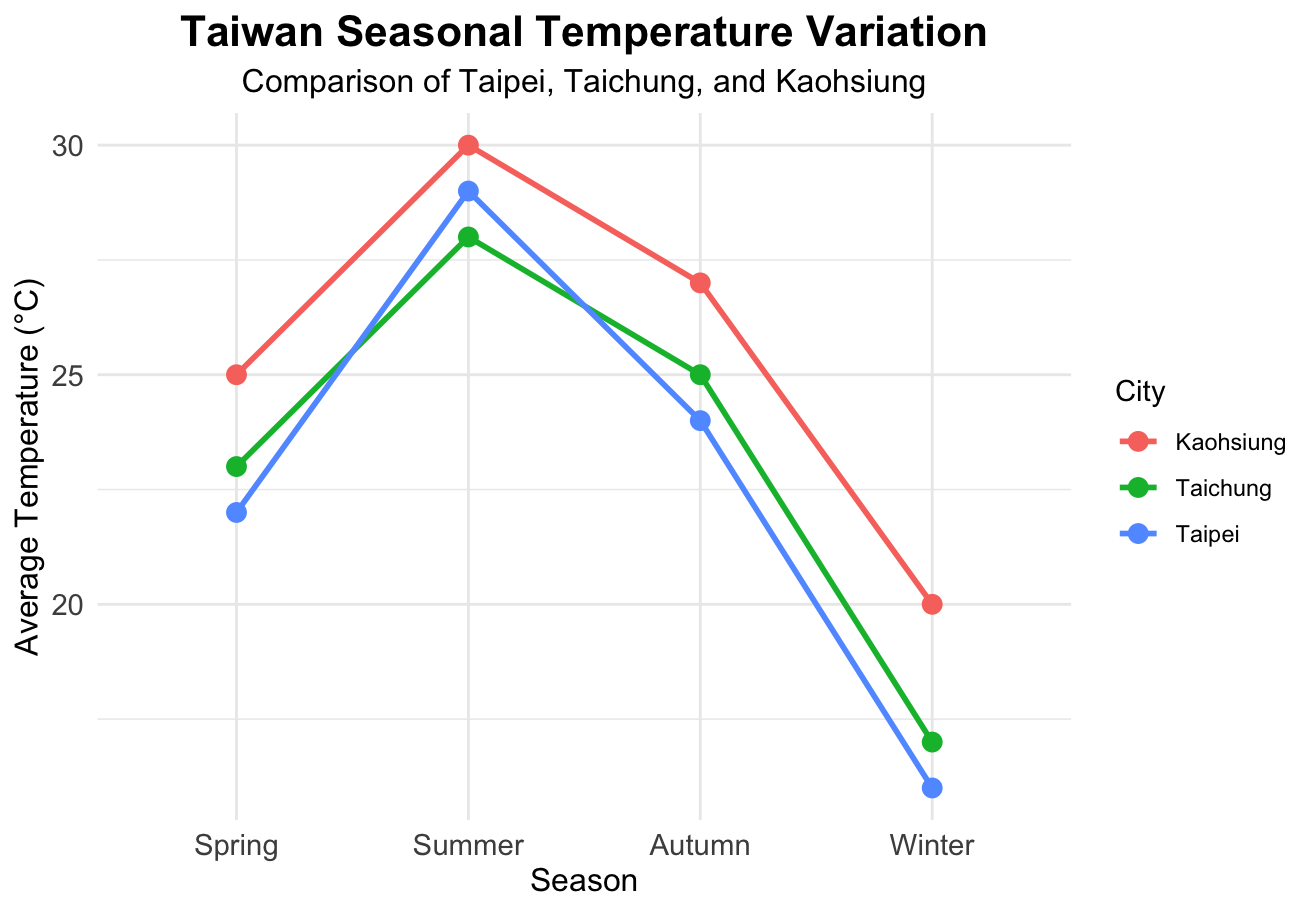
weather_data <- data.frame(
Season = c("Spring", "Summer", "Autumn", "Winter", "Spring", "Summer", "Autumn", "Winter", "Spring", "Summer", "Autumn", "Winter"),
City = c("Taipei", "Taipei", "Taipei", "Taipei", "Taichung", "Taichung", "Taichung", "Taichung", "Kaohsiung", "Kaohsiung", "Kaohsiung", "Kaohsiung"),
Temperature = c(22, 29, 24, 16, 23, 28, 25, 17, 25, 30, 27, 20)
)
# 檢視輸入的資料結構
print("--- 原始資料 ---")
print(weather_data)
# 2. 資料整理與轉換
# 檢查欄位狀態
str(weather_data)
# 將 Season 轉換為因子(Factor),並明確指定「春、夏、秋、冬」的順序
weather_data$Season <- factor(
weather_data$Season,
levels = c("Spring", "Summer", "Autumn", "Winter")
)
# 再次使用 str() 確認型態已改變
print("--- 整理後的資料結構 ---")
str(weather_data)
# 3. 載入 ggplot2 套件並繪圖
library(ggplot2)
# 開始繪圖
ggplot(data = weather_data, aes(x = Season, y = Temperature, color = City, group = City)) +
# 繪製折線
geom_line(linewidth = 1) +
# 繪製資料點
geom_point(size = 3) +
# 設定圖表標題與軸標籤
labs(
title = "Taiwan Seasonal Temperature Variation",
subtitle = "Comparison of Taipei, Taichung, and Kaohsiung",
x = "Season",
y = "Average Temperature (°C)",
color = "City"
) +
# 套用乾淨簡潔的主題
theme_minimal() +
# 微調字體大小與標題居中
theme(
plot.title = element_text(size = 16, face = "bold", hjust = 0.5),
plot.subtitle = element_text(size = 12, hjust = 0.5),
axis.title = element_text(size = 12),
axis.text = element_text(size = 11)
)- 圖表輸出
-
ggplot2 可以由上述的程式看到基礎的操作方法與清晰的圖表。
-
(1) 利用堆疊的方式來加上我們想要的資訊。
-
(2) 從幾個物件組合 (data/aes()/geom_line()/geom_point()/labs()/theme_minimal()/theme()),就可以得到我們想要輸出的樣子。
-
大家也可以試著用 ggplot2 產生你們生活中有趣的事情吧!
- 資料來源:
- (1) R 軟體
- (2) Gemini
- (3) 中央氣象署